Tag Archives: Visual Rhetorics

Music Typography.

Standard

We have been studying presentation design and techniques in class with the help of Presentation Zen by Garr Reynolds & Resonate by Nancy Duarte.  A presentation should have a clear and provoking message. For our final project in Visual Rhetorics we had to create and design a presentation that could stand alone. I have an unfaltering passion for everything music (See: basically every other post on this blog). I decided to combine it with another area of study that I’ve really enjoyed learning about this semester—typography!

music typography

Bands’ logos are recognizable and timeless. What’s interesting to me though is that some of their logos are actually just fonts. It is not just the iconic sounds and album art from their albums that have transcended time (although those are GREAT too); the typography is what’s made them and their brand truly memorable. What’s also really cool here is that some of the typography used by popular bands has not even ever actually appeared on one of their album covers. The infamous logo created by Brian Pike for the The Who is a solid example of this.  It was used in promotional flyers for the band’s gigs as well as the art for Keith Moon’s drum set. Also, some of the fonts are so recognizable that their names have become synonymous with the bands who brought them into being. Some prime examples being: Pink Floyd, The Sex Pistols, Metallica, KoЯn, Megadeath, Misfits, Rammstein, Thin Lizzy, Bon Jovi, etc.  As you can see the music genres vary widely, but nonetheless, their typography choices weren’t merely coincidental. Typography enthusiasts were clamoring to find out what the font names being used by some of these bands were; however, since some of them were specially created by designers for the band, there wasn’t any way to use them. Thankfully, some typography saviors out there decided to create fonts that closely mirrored or were identical to the ones we associate with those bands.  You can find many of them online that are free to download. Hallelujah!

1970-Typography

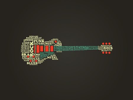
For this project, I decided to focus on rock music—teetering on both classic and punk rock music— from the 1970s to signify how music typography has had a lingering impact.


I picked ten bands that should definitely be recognized as fairly prominent heavy weights in the rock and music culture.  They all also have very memorable logos: Led Zeppelin, Pink Floyd, The Beatles, The Rolling Stones, Kiss, The Doors, AC/DC, The Sex Pistols, The Ramones, and The Who.

music typog

The fonts used are:

  1. Led Zeppelin-  Dyer
  2. Pink Floyd- Floydian
  3. The Rolling Stones- Clarenden
  4. The Beatles- Bootle
  5. AC/DC- Squealer
  6. Kiss- Die Nasty
  7. The Doors- Densmore
  8. Sex Pistols- Sex Pistols
  9. The Ramones- Franklin Gothic Heavy
  10. The Who- Futura

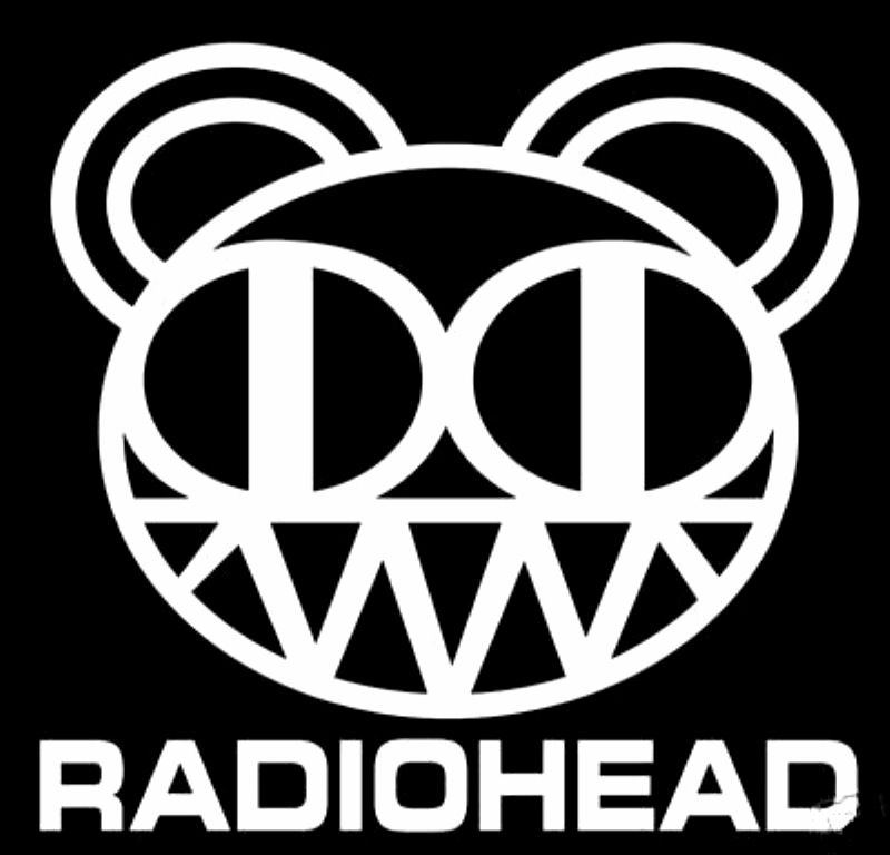
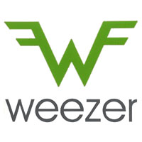
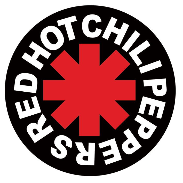
Some more modern day music typography and band logos that you might recognize include: Radiohead, The xx, Weezer, RHCP, Muse, Thursday, Nirvana, Run DMC, and many, many more.  I’ll probably geek out on a future post about the glory of band logos–so stay tuned.

radiohead

xx weezer rhcp muse thursday nirvana rundmc

I did thorough internet research to identify the proper fonts and I think I got as close as I could (fingers crossed)! The whole presentation was created through PowerPoint 2010 and saved as a .mov file and exported to Windows Movie Maker.  I then just simply uploaded it to YouTube and voilà! Prior to all of this I just had to customize and adjust the timing of each slide.  However, there are countless ways and numerous programs that can help you to achieve the same effect.

The majority of the “images” used here are actually just music fonts. How cool is that?! If you want to download any of them for free you can find them here.

rockandroll

ALL AGES from FontSpace

I ultimately wanted the whole presentation to run smoothly with the beat of rock and roll—à la the song choice of Zeppelin’s famous “Rock and Roll”  which is the second track from their fourth album in 1971—I know creative choice, right? Anyways, I hope you have as much fun watching the presentation as I did making it. Music and typography are both beautiful things and together they’re unstoppable.

If you are interested in learning more about music typography, here’s a great blog to check out called Rock that Font. If you know of anymore, please do not hesitate to share! Until then, rock on.

Digital Strangers.

Standard

My latest Visual Rhetorics video project addresses what it actually means to see through mediums.  In class, we discussed how the social web facilitates the growing trend towards more mediated (indirect) and shareable experiences.  Every moment of everyday seems to be being captured via mobile devices and published on social media platforms.  I’ve probably seen more sunsets than any person should see in a lifetime by scrolling through my Instagram feed (not that I’m complaining, most of them are quite beautiful). I go to a lot of concerts and everyone there films them and watches the performances through their screens.  It makes me wonder if they forget that they’re seeing their favorite band live.  If I wanted to watch a video of the band, I could just Google them.  Why isn’t the (musical) experience of being there enough anymore?  How has a screen replaced the phantasmagorical concert experience as a whole amongst some fans? Is this trend of visually documenting everything we do taking away from the actual experience of living? What are the social implications of it?

Individuals are now navigating with technological devices that appear to be glued to their hands.  They’re not seeing with their eyes or thinking with their minds–they’re seeing through screens and thinking with computers.  I fear sometimes that this obsession with technology is bordering on self-destruction. The video Dawn and I made reflects on some of these questions and more around our university’s campus–introducing the idea that we are living in a culture of lost digital strangers.


Yes, we might have “friends” on Facebook, or “followers” on Instagram, Tumblr, or Twitter, but what do they really know about us?  We walk past people each day, ignoring them and the scenery around us, in favor of screens that present manipulated, crafted, and sometimes distorted, representations of them.  Digital identities on screen can sometimes vary widely from a person’s real life persona.  People present information that they want others to see in order to show the best parts of their life.  However, we know that life is not always as glamorous as what is presented via social media.

We are living in a culture where sharing every detail of one’s life is an addictive phenomenon.  We are digital “friends”, but ultimately digital strangers.  We have created a digital divide amongst ourselves and have taken the notion of real friendship for granted.  What will this mean for our futures?  Will we always be “friends” with people who we would have normally grown apart with over time?  Is there anyway to create a digital distance between us and others without offending or losing touch with them? Why isn’t calling someone, or visiting them in person, seen as an act of friendship amongst this generation anymore?  Since when did texting, emailing, and newsfeeds, become the things that run our social, professional, and personal lives?  Are we using technology, or is it using us?  Conversations like this are certainly worth having, and I sincerely hope that you consider what role technology is playing in your life.  I’m interested to see the cultural shifts that will happen in the future due to this dependence on digital devices, but until then I’m going to unplug, go outside, and watch a real sunset.

A special thank you to Arcade Fire for the very relevant and appropriate song “We Used to Wait” that we used in our video. Another thank you to Aaron Koblin and Chris Milk’s great project of wildernessdowntown.com where we snagged some of our video footage and to any students who participated in the making of this video.

Cinemagraphs.

Standard

I’ve really been focusing my efforts on visual story designs this past semester.  In class, we discuss how effective arguments rely increasingly on the power of images to persuade their audience. Overall, we have been examining how images communicate meaning to tell powerful stories. Last week, we adventured outdoors to experience contemplative photography.  Using these images and storytelling methods, we practiced how to shoot and sequence photos that tell stories about a person, place, event, or trend.  I mostly took nature pictures because well, I’m kind of an earthy girl and the beauty of nature just always amazes me. To compliment our photography we have been talking about the growing global visual culture and the expanding trend toward more mediated and shared experiences.

Our latest project was to create a cinemagraph.  When I first saw the term, I had no idea what it was or what it meant.  However, after looking at a few examples, I realized it was something I see all over the internet–especially on sites such as Tumblr. A cinemagraph is an image that contains within itself a living moment that allows a glimpse of time to be experienced and preserved endlessly.  Some of my favorites are a series shot from NYC!

chelsea-hotel-4429

The official cinemagraph website shares the history of this glorious creation:

“Visual Graphics Artist Kevin Burg began experimenting with the .gif format in this style in 2009 but it wasn’t until he partnered with photographer Jamie Beck to cover NYFW that Cinemagraphs were born. Marrying original content photography with the desire to communicate more to the viewer birthed the cinemagraph process. Starting in-camera, the artists take a traditional photograph and combine a living moment into the image through the isolated animation of multiple frames.”

cab-window-429

“Beck and Burg named the process “Cinemagraphs” for their cinematic quality while maintaining at its soul the principles of traditional photography. Launched virally through social media platforms Twitter and Tumblr, both the style of imagery and terminology has become a class of its own. The creative duo are looking forward to exploring future display technologies for gallery settings as well as pushing this new art form and communication process as the best way to capture a moment in time or create a true living portrait in our digital age while embracing our need to communicate visually and share instantly.”

newspaper-man-429

This new trend with images and storytelling is fascinating.  Needless to say, I was more than excited at the prospect of learning how to create one of my very own.  Seriously, how cool are they?  Taking original content photography and adding a cinematic twist through the manipulation and isolation of animation in certain frames is an innovative idea. These animated photographs really do capture a moment in time or a living portrait of a person or place– ultimately leading to an intriguing method of storytelling. Here’s the tutorial I watched while creating my own cinemagraph.  I used Adobe Photoshop and had to save it in an animated GIF format when I was done with the project.

I went to my school’s Digital Media Zone (DMZ) in the library for assistance, where I received the greatest amount of help!  The DMZ is equipped with cutting-edge technologies and equipment for audio, video, graphics, 3D, and animation projects.  One of the knowledgeable assistants worked with me to teach me some of the basics of Photoshop (thank goodness!)  We also discussed ways to improve and enhance the image during the creation of the cinemagraph.  It was a new experience for both of us, but overall the session was very informative and loads of fun.

The key to making a successful cinemagraph is to use something that has a subtle, yet consistent, movement.  The first thing that came to mind for me were (of course) records!  I thought the spinning motion would look great and really stand out in a still frame.  I ended up shooting a couple of possible videos with my iPhone– one of them was my glowfish swimming in a glass bowl.  I think that the constant ripples in the water, along with the still image of the neon yellow fish, would have made a great cinemagraph.  However, even though this video came out great, I thought it might be a little too difficult for my first attempt at a cinemagraph.  I hope to go back sometime in the future and create it!  Any fin is possible if you don’t trout yourself (Yes, that fish pun was completely necessary).

Anyways, as I sifted through my record box I finally decided to use Death Cab for Cutie’s album Plans.  (I’ll let you in on a secret, the other ones on the table were all close seconds!)  This first version is a more traditional and simple approach with the record player as the focal point.

record1

I set up my record player on my kitchen table, and thought that this album might stand out more and contrast with the white background.  I was also drinking a can of Arizona Green Tea because…well I’m always drinking green tea.  My fruit bowl was just an innocent casualty in this project, but I thought it added a nice autumnal touch.  After all, fruit bowls make countless appearances in many famous still life paintings– I thought I’d welcome the same idea into the digital age.

record2

I applied an underwater filter to version two of this cinemagraph just for fun.  I ended up really liking it, but maybe that’s just because seafoam green and blue are my favorite colors.  I honestly could have probably kept tweaking the colors and settings of the cinemagraph for hours.  Photoshop really is a labyrinth of welcomed, and sometimes complicated, creativity.

I hope all of you find some inspiration to create your own cinemagraph.  It could really be anything!  If you have a camera, that will work well, but using something like your cell phone will also work alright too.  I’ve also heard that there are some neat cinemagraph apps that I plan to look into.  However, for more detail, control, and precision, I would highly recommend giving Photoshop a chance if you can.  I think that creating a series of cinemagraphs would make a great addition to any digital portfolio.  They require a close eye, and who knows, maybe you’ll find yourself slowing down and appreciating the details of things around you more.

Contemplative Photography.

Standard

“Have you ever thought of using your camera as a meditation tool?”

“The photographic image not only records what it is pointed at – it speaks to the photographer’s relationship with the world and their quality of presence. Are you looking, seeing, trying, rehearsing? Are you present to what is before you?”

Today in class, I was introduced to the concept of contemplative photography.  Some of the questions mentioned above are discussed in this video:


According to the video, Miksang is a Tibetan word that translates as ‘Good Eye’, and was developed by photographer Michael Wood and based on the Shambhala and Dharma Art teachings of the late Buddhist teacher and artist Chögyam Trungpa Rinpoche.

Miksang is described on the official site as:

“…concerned with uncovering the truth of pure perception. We see something vivid and penetrating, and in that moment we can express our perception without making anything up—nothing added, nothing missing. Totally honest about what we see—straight shooting….When we synchronize eye and mind, we abandon all concepts and predispositions and become completely present in the moment. The world becomes a magical display of vivid perception. We can develop the ability to experience and express these experiences precisely through the practice of contemplative photography.”

I found this new concept of photography completely enthralling.  Living and meditating in the moment, and overall just being really present with what you’re seeing and feeling— it all is a great way to describe photography. The video even has a great visual exercise of the human camera.  You close your eyes, rotate, open them for a second, and shut them.  You repeat this process a few times, and take in what you see.  It’s really an exercise in perspective and perception.  It’s a neat exercise, so if you’re feeling spirited– give it a go!

To practice this method, we got to take our cameras/phones outside (autumn is the PERFECT time for photographs).

We had to focus on three specific elements: Color, Texture, and Deep-Diving.  Below I have the directions we had to follow.  I’ll include some of the photos I took today with them.  Feel free to try this photography exercise and share your own!

1. COLOR- the most powerful and basic element of the world of form.

  • Keep a narrow focus of color
  • Look JUST at a color in a simple and open way
  • Look for vivid and bold color
  • Look at color out of context– without meaning
  • Look for unexpected flashes of color out of the corner of your eye– capture those flashes
  • Shoot 20-30 instances of color

photo2  photo13

2. TEXTURE- search for the feeling, quality, and experience of texture.

  • You can feel texture everywhere; the bark of a tree, the roughness of concrete, the smoothness of steel
  • How do you see texture?
  • How does it help you to connect with form?
  • How does the quality of light affect texture?
  • Photograph 20 examples of what texture feels like

photo1 photo12


3. Deep-Dive- Choose one object to explore thoroughly.  (The object I used is a traffic cone, in case you were wondering!)

  • Choose a subject that does not have a lot of photographic interest. (A pencil, a dumpster, a wall, a sink).
  • The point is to see the object with a fresh perception– to see its essence
  • Look at your object as if you’ve never seen it before
  • Start shooting what you see
  • Try new perspectives and vantage points
  • Try close-ups, mid-range, and long-range shots
  • Keep looking at your object and see it in new ways
  • Capture at least 20 different ways of seeing your object

photo7 photo5


This was a great exercise in really seeing images and not creating them.  I was happily overwhelmed by all of the beautiful foliage outside today, and got a bit carried away while shooting.  I’m pretty much a nature fanatic and getting the opportunity to lay in the grass and dirt felt like heaven.  Exploring outside always feels like a gift, but exploring with a camera opens your eyes to the smallest of details– specifically with color, texture, and oddly beautiful objects and scenes.  Contemplative photography is an avenue of visuals that I hope to continue developing (no pun intented!) I encourage you to try the above exercise and get out there with your camera.  You never know what you might find!

Vivid Visuals.

Standard

I’m continuing my reading of Rebecca Hagen’s White Space is Not Your Enemy, and this week I’m focusing on the chapter that discusses the importance of photos, illustrations, and overall visual appeal.  I spent the last couple of weeks geeking out about music infographics (truth be told, I still am), but there’s definite value in that.  Visuals are memorable, and unfortunately sometimes data is not.  Combining the two is an incredible way to share content and ideas that are worth spreading (TED talks, anyone?).  Here’s the thing though.  All of us have sat through those treacherous powerpoint presentations where we are blinded by walls of text.  We can’t acutely read and listen at the same time.  We’re not information computing robots.  Well, at least I’m not.

Illustrations, photos, and infographics all work together to set tone, add interest, provide valuable information, and visually break up those walls of texts.  Visuals are what let presentations, the presenter, and the viewers breathe.  They create movement and rhythm, and just like text, they can communicate a visual hierarchy.  I should probably emphasize here that  the quality of images can also make or break a presentation.  If you want your audience to focus on your presentation, those photos best be in focus.  If somehow your images are distorted they could just end up being a detrimental distraction to your presentation instead of an alleviating aid.

Taking the time to carefully edit, crop, create balance, use successful lighting, and all of that jazz will impact the quality of your photo.  To make photos with a more interesting composition, Hagen encourages readers to remember to also consider the rule of thirds:

ruleofthirds2

ruleofthirds4ruleofthirds3

Looking at the technical aspects, such as: resolution, file format, and the size of the photos you wish to share is also important.  You don’t want your digital images to appear pixellated, fuzzy, or distorted in any way.  Hagen offers some more advice on EPS, GIF, JPG, TIF, PNG, and SVG file formats and when they are most applicable to use:

File Formats

If your not really that interested in photography, but want good quality photos for a presentation, you might want to consider digital stock sites.  There are huge inventories to sift through, and prices vary depending upon the format and resolution of the images.  On these sites you can also find illustrations, video clips, and stock animations.  They also offer complimentary (comp) images for free, but these often contain watermarks to prevent people from using the images without paying.  If you do decide to use a stock site, be prepared to face certain restrictions.

If you really want your presentation to be your creation though, I highly suggest to try taking the photos yourself if you have the time!  Enjoy the adventure of every camera snap and click, whether good or bad.  Presentations can be a stressful process, but with a little more creativity and enthusiasm they can be a valuable learning experience.

Reading more about photography makes me wish I had a nicer camera.  I think I have a new ambition to become a shutterbug.